✔️ CSS 레이아웃
1-01. 토픽 소개
- Normal Flow : 일반적인 글의 흐름대로 배치
- Position : 일반적인 흐름에서 벗어나 직접 위치를 정하는 것
- Flexbox : 박스를 만들고, 방향을 정해 박스 안에 요소를 배치하는 것
- Grid : 박스에 칸을 나누고, 그 칸에 요소를 배치하는 것 (ex. 바둑판처럼)
✔️ Position
2-01. position 속성
- static : 디폴트값. 일반적인 글의 흐름대로. 원래 있어야 하는 곳에 있는 것
여기서부터 글의 흐름과 상관없이 정하는 값
- relative
- absolute
- fixed
- sticky
- position 속성으로 기준을 설정, top/right/bottom/left 값으로 위치 설정
- +면 block 안쪽으로, -면 바깥쪽으로
2-02. relative 포지션
.green {
	position : relative;
    top : 30px;
}
- 기준 : 원래 얘가 배치된 곳
- 원래 있어야 하는 곳으로부터 위에서 30px만큼 간격이 있도록 움직임.
- margin 과의 다른 점 : margin으로 설정하면 다른 애들이 얘에 맞춰서 같이 움직이지만, position으로 설정해주면 다른 애들은 전부 그대로 있고 얘만 움직이는 거임.
- 원래 있던 자리는 공백으로 비워둔다.
2-04. absolute 포지션
- 기준 : 가장 가까운 positioning된 조상 요소
- positioning : position 속성이 static이 아닌 값으로 바뀐 것.
- 원래 있던 자리 비워두지 않음. -> 배치에서 아예 빠지기 때문에 자리 차지를 안하는 것!
- inset : 0; : 모든 방향에 대해 0px
2-07. fixed 포지션
- 기준 : 브라우저 화면
- 화면 스크롤해도 움직이지 않고 고정되어 있음
- 원래 있던 자리 비워두지 않음. -> 따로 크기를 정해주지 않으면 자동으로 요소 만큼만 설정됨.
- 좌우로 꽉 채우려면 width : 100%; 또는 right&left : 0;
- 전체 main에 얘만큼의 margin을 주면 가려지는 부분 없앨 수 있음
- ex. 내비게이션
2-09. sticky 포지션
- 기준 : 브라우저 화면
- 요소를 웹 브라우저에 달라붙도록(스크롤해서 지정한 위치에 닿으면 거기에 붙어있는 것!)
- 지정한 위치로 가기 전까지는 원래 위치에서 공간 차지함. (static)
- 지정된 위치로 가면 fixed 상태가 되는 것.
- 부모 요소 안에 갇혀있음. (처음에 static이니까) -> 계속 붙어있다가도 부모 요소가 화면밖으로 나가면 같이 나감!
+ daily mission
absolute의 경우 가장 가까운 포지셔닝된 조상 요소를 기준으로 하므로 반드시 부모 요소가 필요한 건 맞지만, sticky의 경우에는 부모 요소가 만약 존재한다면 그 부모요소에 갇혀있게 되는 것이지 반드시 부모 요소가 필요한 건 아닙니다. 그러나, <body>태그에 거의 모든 요소가 담겨있을 수밖에 없기 때문에 <body>태그를 부모태그로 볼 것인지, 아닌지의 문제라고 할 수 있습니다. <body>는 기본적으로 position이 relative로 설정된다.
2-11. z-index
.red{
	z-index : 1;
}
- 앞뒤의 순서를 정하는 것(디폴트 : 나중에 쓴 코드일수록 앞쪽에 배치됨 -> z-index 값이 같은 경우)
- 속성값 숫자(+- 모두 가능)가 높을수록 앞에 배치됨.
2-13. z-index가 내 맘대로 안될 때
- 쌓임 맥락을 생각해보자 !
- 쌓임 맥락은 조건이 존재한다. -> 얘는 안되면 구글링해보는걸로 ,,

이런식으로 .red에 쌓임맥락이 생겨서 .green도 z-index값이 1로 여겨져 파랑보다 뒤쪽에 배치되는 것!
✔️ Flexbox
3-01. Flexbox란?
- 1차원으로 요소를 배치
- flex-direction : 가로 / 세로 중 배치할 방향 결정 (가로가 디폴트)
- justify-content, align-items : 정렬
- flex-wrap : 요소 넘칠 때
- gap : 요소 간격
- flex-grow, flex-shrink, flex-basis : 크기 늘이거나 줄이기
3-02. 배치 방향
.container {
  display : flex;
  flex-direction : column;
}
- 가로 / 세로 : row / column
- 반대방향으로 배치하고 싶다면 row-inverse 처럼 뒤에 inverse 붙여주기
3-04. 정렬
.container {
  display: flex;
  justify-content: center; /* 기본축으로 중앙정렬 */
  align-items: center;   /* 교차축으로 중앙정렬 */
}
- 기본축(main axis) : 요소가 배치되는 방향 -> justify-content
- 교차축(cross axis) : 기본축과 수직 -> align-items
- 디폴트 : 기본축방향으로 & 교차축 방향으로는 꽉 채워서
- space-between : 기본축 방향으로 양 끝 요소들은 끝에 붙이고 여백 같게
3-08. 요소가 넘칠 때
.container{
	display : flex;
    flex-wrap : wrap;
}
- 넘치는 요소가 교차축을 넘어가서 배치됨
3-10. 간격
.container{
	display : flex;
    gap : 30px 60px; /* 무조건 세로, 가로 순서 -> margin이랑 똑같음 */
}
- gap : flexbox 내에서 요소들간의 간격 조절
3-12. 요소 꽉 채우기
.green {
  background-color: #32b9c1;
  flex-grow : 1;
}

.blue {
  background-color: #5195ee;
  flex-grow : 2;
}
- flex-grow : 기본값이 0 (안늘어나는 것) -> 값이 클수록 더 많이 늘어난다!
- 숫자는 상대적인 값으로 flexbox에서 그만큼의 비율을 차지해줌.
- flex-shrink : 기본값이 1 -> 값이 클수록 더 많이 줄어든다!
- 빈 공간을 채우고 싶을 때 : flex-grow : 1;
- 요소의 크기를 고정시키고 싶을 때 : flex-shrink : 0;
3-13. 플렉스 요소의 크기
flex-grow: 1;
flex-shrink: 0;
flex-basis: 100px;
flex: 1 0 100px;- flex-basis를 사용하면 위와 같이 코드를 줄일 수 있다.
- flexbox에서는 width 대신 flex-basis를 사용하는 걸 더 추천
+ daily mission
flex-basis : auto -> 아이템에 설정된 width 또는 height 속성값을 사용
flex-basis : 0 -> 아이템의 크기를 0으로 주겠다는 것. 따라서 여백이 100%가 되는 셈이다.
=> content 크기와 관계 없이 flex-grow와 flex-shrink 설정 비율대로 너비를 배분한다.
flex-basis : 0 & flex-grow : 1 -> 빈 공간을 다 채울것이다. => flex-grow는 flex-basis를 제외한 여백 부분을 가져가기 때문
3-16. [실습]
언젠가 다시 해보쟈 ...
대충 어떤 식으로 구성해야 되는지는 알겠음 !
3-18. 인라인 안에서 flexbox 만들기
.new-window-link {
  display: inline-flex;
  align-items: center;
  gap: 4px;
}
- inline-flex : 플렉스박스를 만들면서 동시에 박스 전체를 inline처럼 배치함.
3-19. flexbox 안에서 포지셔닝하기
- relative, sticky : 원래 자리를 차지 -> flexbox의 영향 받음
- absolute, fixed : 원래 자리에서 빠지므로 -> flexbox에서도 빠짐
✔️ Grid
4-01. Grid란?
- flexbox의 단점 : 한 방향으로만(1차원) 배치 가능함.
- grid의 장점 : x(col), y(row)방향(2차원)으로 배치 가능하다.
- Grid line : 각 칸을 나누는 줄
- Grid cell : 요소를 배치할 수 있는 각 칸
- 여러 칸에 걸쳐서 배치할 수도 있다.
- grid-template-rows(columns) : 격자 나누기
- gap : 간격
- grid-auto-rows(columns) : 크기 미리 정하기
- grid-row(columns), span : 원하는 위치에, 여러 칸에 걸쳐서 배치
- grid-area, grid-template-areas : 이름으로 배치
4-02. Grid 나누기
.container {
  border: 5px dashed #cacfd9;
  width: 500px;
  height: 500px;
  display : grid;
  grid-template-columns: 100px 300px 100px; /* col 생성 */
  grid-template-rows: 200px 200px 100px; /* row 생성 */
  grid-template : 200px 200px 100px / 100px 300px 100px;
}
- grid-template 으로 합쳐서 쓸 수 있음. (세로(row) / 가로(col) 순서)
4-04. 유연한 크기와 유용한 함수들
.container {
  border: 5px dashed #cacfd9;
  width: 500px;
  height: 500px;
  display : grid;
  grid-template :
  	200px 200px 100px /
  	1fr 2fr 1fr ;
}
- grid 크기를 창너비와 상관없이 고정하려면 -> px
- grid 크기를 창너비에 맞춰 유연하게 하려면 -> fr
.container {
  border: 5px dashed #cacfd9;
  width: 500px;
  height: 500px;
  display : grid;
  grid-template :
  	200px 200px 100px /
  	minmax(200px, 300px) minmax(200px, 300px);
}
- minmax(200px, 300px) : grid 크기를 200px ~ 300px까지 유연하게 사용하겠다는 것
- minmax()에는 최댓값에만 fr 사용 가능 !!
.container {
  border: 5px dashed #cacfd9;
  width: 500px;
  height: 500px;
  display : grid;
  grid-template :
  	1fr 1fr 1fr /
  	repeat(6, 1fr);
}
- repeat(6, 1fr) : 1fr을 6번 반복하라는 뜻
4-06. 간격 넣기
gap : 16px;4-07. 크기 미리 정해두기
grid-template-columns : repeat(3, 1fr);
grid-auto-rows : 50px 100px 200px;
- 크기를 따로 정해두지 않았을 때, grid-auto-rows 이용
- 50px 100px 200px이 반복되어 적용됨.
4-09. 원하는 위치에 요소 배치하기
grid-row : 3 / 5;
grid-column : 2 / span 3;
- 그리드 cell이 아니라 line에 번호가 매겨짐!
- grid-row : 3 / 5 ; -> line 3부터 5까지 차지하라는 뜻
- 2 / span 3 : line 2부터 3칸을 차지하라는 뜻
4-12. 이름으로 배치하기
.red {
  background-color: #e46e80;
  grid-area: r;
}
- 각 요소에 grid-area를 이용해서 이름을 붙일 수 있음
.container {
  border: 5px dashed #cacfd9;
  width: 500px;
  height: 500px;
  display: grid;
  grid-template:
    repeat(2, 1fr) /
    repeat(2, 1fr);
  gap: 16px;
  grid-template-areas:
  ". g"
  "r b"
  ;
}
- grid-template-areas를 이용하면 이름으로 배치 가능.
✔️ 코드잇 뮤직
5-01. [실습] 랜딩 페이지
- HTML
<!DOCTYPE html>
<html lang="ko">
<head>
<meta charset="utf-8">
<title>Codeit Music</title>
<link rel="stylesheet" as="style" crossorigin href="https://cdn.jsdelivr.net/gh/orioncactus/pretendard@v1.3.6/dist/web/static/pretendard.css">
<link rel="stylesheet" href="style.css">
</head>
<body>
<header>
<div class="wrap">Codeit Music</div>
</header>
<section class="hero">
<video src="videos/bg.mp4" class="bg" autoplay loop muted></video>
<div class="hero-heading">
<h1>
<span class="small">코딩을 넘어</span><br>
<span class="big">음악의 즐거움</span>까지.
</h1>
</div>
</section>
<section class="headline wrap">
<img class="headline-image" src="images/phone.png" alt="앱 실행 화면" width="504" height="520">
<div>
<h2 class="headline-heading">
내 손안의<br>
작은 파티,
</h2>
<p class="headline-description">
Codeit Music에서 인기있는 음악을<br> 3개월 동안 무료로 들어보세요.
</p>
</div>
</section>
<section class="promotion">
<div class="promotion-content">
<h2>모든 음악과 뮤직 비디오<br>3개월 내내 33% 할인</h2>
<p>평색 오직 한 번 뿐인 혜택</p>
</div>
<button class="promotion-button">멤버십 가입하고 혜택 받기</button>
</section>
<section class="wrap">
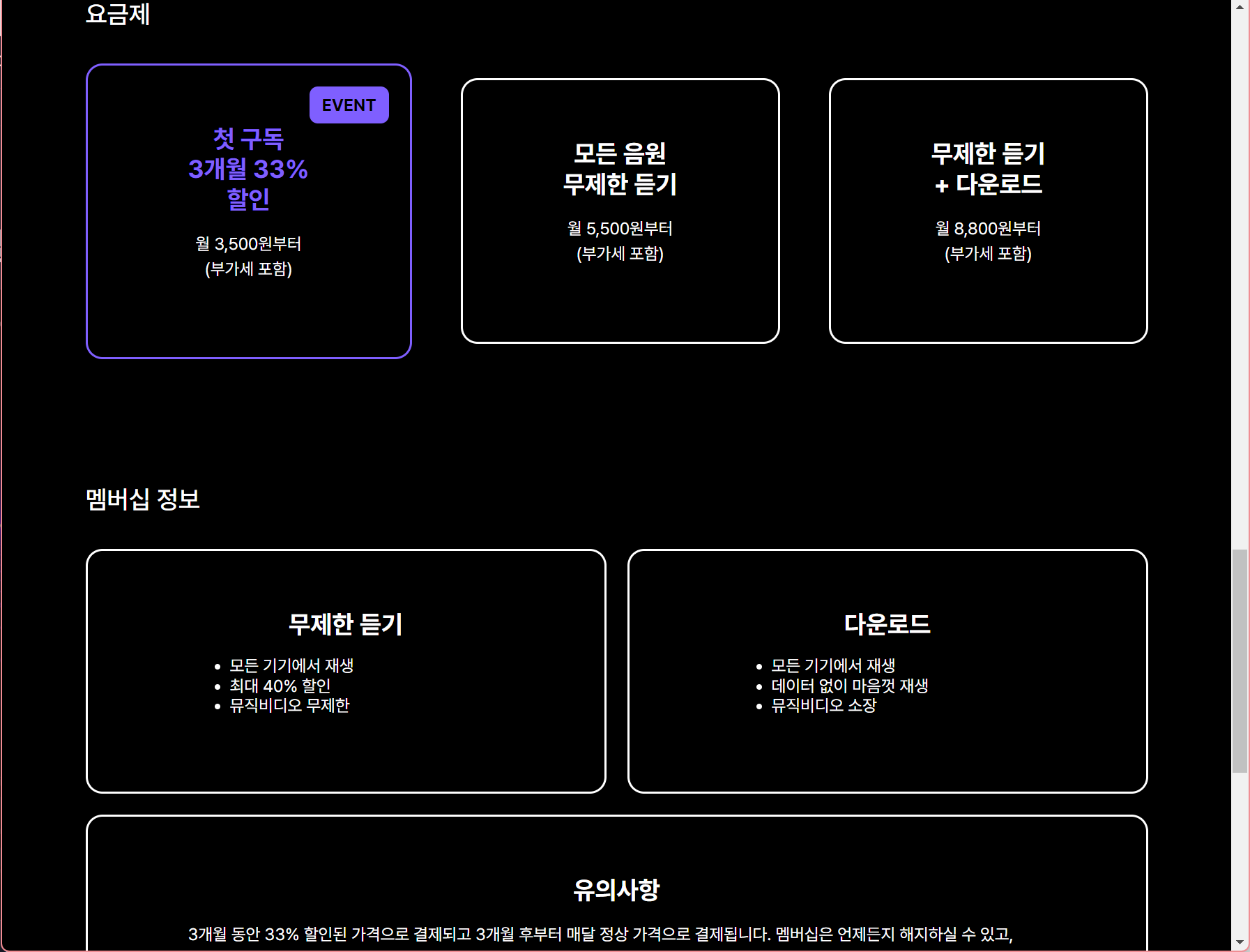
<h2 class="plans-title">요금제</h2>
<div class="plans">
<div class="card event">
<div class="event-badge">EVENT</div>
<h3>
첫 구독<br>
3개월 33%<br> 할인
</h3>
<p>
월 3,500원부터<br>
(부가세 포함)
</p>
</div>
<div class="card">
<h3>
모든 음원<br>
무제한 듣기
</h3>
<p>
월 5,500원부터<br>
(부가세 포함)
</p>
</div>
<div class="card">
<h3>
무제한 듣기<br>
+ 다운로드
</h3>
<p>
월 8,800원부터<br>
(부가세 포함)
</p>
</div>
</div>
<h2 class="benefits-title">멤버십 정보</h2>
<div class="benefits">
<div class="card listen">
<h3>무제한 듣기</h3>
<ul>
<li>모든 기기에서 재생</li>
<li>최대 40% 할인</li>
<li>뮤직비디오 무제한</li>
</ul>
</div>
<div class="card download">
<h3>다운로드</h3>
<ul>
<li>모든 기기에서 재생</li>
<li>데이터 없이 마음껏 재생</li>
<li>뮤직비디오 소장</li>
</ul>
</div>
<div class="card wide">
<h3>유의사항</h3>
<p class="caution">
3개월 동안 33% 할인된 가격으로 결제되고 3개월 후부터 매달 정상 가격으로 결제됩니다.
멤버십은 언제든지 해지하실 수 있고, 추가로 부담해야 할 금액은 없습니다.
모든 가격은 부가가치세가 포함된 가격입니다.
</p>
</div>
</div>
</section>
<footer>
<div class="footer-content wrap">
<div class="footer-nav">
<a href="#">코드잇 소개</a>
<a href="#">사용자 이용 약관</a>
<a href="#">개인정보 취급방침</a>
<a href="#">자주 묻는 질문</a>
<a href="#">고객 센터</a>
</div>
<div class="footer-info one">
(주) 코드잇<br>
대표 KANG YOUNG HOON, 이윤수<br>
개인정보보호책임자 강영훈
</div>
<div class="footer-info two">
사업자 번호 313-86-00797<br>
통신판매업 제 2019-서울중구-1034 호<br>
서울특별시 중구 청계천로 100 시그니쳐타워 동관 10층 코드잇
</div>
</div>
</footer>
</body>
</html>- CSS
*{
  box-sizing : border-box;
}

html {
  font-family: Pretendard, sans-serif;
  word-break: keep-all;
}

body {
  background-color: #000;
  color: #fff;
  margin: 0;
}

.wrap {
  max-width: 1080px;
  width: 100%;
  margin: 0 auto;
  padding: 32px;
}

header {
  background-image: linear-gradient(
    180deg,
    #000000 15.1%,
    rgba(0, 0, 0, 0) 100%
  );
  padding: 16px;
  font-weight: 700;
}

.hero{
  position : relative;
}

.bg {
  width: 100%;
  opacity: 0.5;
}


.hero-heading {
  margin: 0;
  padding: 24px;
  background-image: linear-gradient(rgba(0, 0, 0, 0) 50%, rgba(0, 0, 0, 1) 100%);

  position : absolute;
  inset : 0;
}

.hero-heading h1 {
  font-weight: 400;
  font-size: 80px;
  line-height: 95px;
  text-align: center;
  color: #ffffff;
}

.hero-heading .small {
  font-size: 48px;
  line-height: 57px;
  text-align: center;
  color: rgba(217, 217, 217, 0.5);
}


.hero-heading .big {
  font-weight: 700;
}

.headline.wrap{
  display : flex;
  justify-content: space-between;
  align-items: center;
}

.headline-image {
  width: 504px;
  height: 520px;
}

.headline-heading {
  font-weight: 700;
  font-size: 56px;
  line-height: 67px;
  margin: 32px 0;
}

.headline-description {
  font-size: 24px;
  line-height: 29px;
}

.promotion {
  background-color: #280357;
  margin: 200px 0;
  padding: 80px 180px;

  display : flex;
  justify-content: space-between;
  align-items: center;
}

.promotion-content h2 {
  font-weight: 400;
  font-size: 40px;
  line-height: 48px;
  margin: 24px 0;
}

.promotion-content p {
  font-size: 24px;
  line-height: 29px;
}

.promotion-button {
  background-color: transparent;
  border: 1px solid #fff;
  padding: 24px;
  border-radius: 16px;
  font-size: 24px;
  line-height: 29px;
  color: #fff;
}

.plans-title,
.benefits-title {
  font-weight: 500;
  font-size: 24px;
  line-height: 29px;
  margin: 32px 0;
}

.card.listen{
  grid-area : l;
}

.card.download{
  grid-area : d;
}

.card.wide{
  grid-area : w;
}

.benefits{
  display : grid ;
  grid-template-rows: 1fr 1fr;
  grid-template-columns: 1fr 1fr;
  grid-template-areas:
  "l d"
  "w w";
  gap : 20px;
}

.plans {
  margin-bottom: 120px;
  display : flex;
  justify-content: space-between;
  align-items: center;
}

.card {
  padding: 56px 96px;
  border: 2px solid #ffffff;
  border-radius: 16px;
  text-align: center;
}

.card.event {
  border-color: #7f5fff;
  position : relative ;
}

.card h3 {
  font-weight: 700;
  font-size: 24px;
  line-height: 29px;
  margin: 0 0 16px;
}

.card.event h3 {
  color: #7f5fff;
}

.card p {
  line-height: 24px;
}

.card ul {
  text-align: left;
  line-height: 19px;
}

.card.event .event-badge {
  background-color: red;
  font-weight: 700;
  padding: 8px 12px;
  background: #7f5fff;
  color: #000000;
  border-radius: 8px;

  position : absolute;
  top : 20px;
  right : 20px;
}

.caution {
  text-align: left;
}

footer {
  margin-top: 160px;
  padding: 64px 180px 80px;
  background-color: #14161f;
}

.footer-content.wrap{
   display : grid;
  grid-template : 1fr 1fr / 1fr 1fr;
  grid-template-areas :
  "n n"
  "o t";
}

.footer-nav{
  display : flex;
  justify-content: space-between;
  grid-area : n;
}

.footer-content a {
  color: #ffffff;
  text-decoration: none;
}

.footer-info {
  color: #ffffff;
  color: rgba(255, 255, 255, 0.4);
}

.footer-info.one{
  grid-area : o;
}

.footer-info.two{
  grid-area : t;
}
position : absolute; inset: 0;
을 이용해서 비디오와 겹치게, 화면 가운데로 글씨를 옮겼다.


두 block 모두 flexbox와 space-between을 이용해서 옆에 배치해 주었다.
가장 시간을 많이 뺏긴 부분이다.
요금제 부분은 flexbox로, 멤버십 정보 부분은 grid로 구현했다.
근데 왜 보라 박스만 커지냐고요.......💢
아마 flexbox로 해서 그런것 같은데, card의 width를 30%로 고정시켜주면 해결됐었다. (그렇게 하면 멤버십 부분 박스가 너무 작아져서 삭제했다) -> 이제 생각하니 flex-basis를 조정해주면 해결될 것 같다!
답지는 grid로 해서 width값 설정 없이 했던걸 보면 사실 grid로 해서 gap있게 하는게 제일 편할듯하다!

마지막으로 footer부분은 2*2grid로 구현하였다.
그리고 위에 부분은 따로 떼서 flex box & space-between으로 구현해주었다.
23/09/11
슬슬 많은 걸 배우니까 헷갈리고,, 뭐를 어디에 써먹어야 되는지 잘 모르겠다ㅜㅜ
실습을 많이 해봐야겠다..!
* position이랑 display 헷갈리지 않기!